As I sat in a crowded auditorium, sipping my coffee, listening to pencils furiously hit paper I felt like I was back in college. But I wasn’t learning the same. Two years earlier I had heard a variety of speakers at the AIGA National Design Conference, and now – approaching my one-year with a ‘big girl job’ and at The Brandon Agency – I was hearing some of them again at the Weapons of Mass Creation Fest in Cleveland. The difference, for me at least, was the realization of how differently I was viewing ideas and interpreting information.
Michael Bierut, a partner at Pentagram, and one of my favorite designers (even if I am little biased because he grew up outside of Cleveland, just like me) said one of the things I remember most from my three-day experience. He said: “It feels good to sell someone back something they already own.”
Bierut was referring to the logo re-design for Saks Fifth Avenue. His team developed an iconic and ubiquitous logo based off of the history and the dozen logos the company previously used. Critics everywhere seemed to enjoy the simplified, refined and modernized logo, but that is not always the case.
It brings up a good question. When is the right time to re-brand your logo? A hard question to answer – with the ‘when’ being different for every company. Sometimes a complete redo – throwing out the old in favor of something new – is not the answer. Sometimes the best solution is an update of the old logo.
Here are five tips you should take into consideration before re-designing your logo:
- What is your logos best quality? Is it the prominent letter, historic mark or decorative element? Understanding this can help make your decision to update or redisgn your logo easier.
- Does the brand’s historical past or old logos inspire something refreshed? Remember selling back something that is already owned feels really good. It’s ok to look at what was done before to generate ideas.
- How can I simplify my logo? Currently, flat design and two color logos are trendy. So think about what elements and colors matter the most to represent your brand. You can eliminate some of the finer details in your logo while still holding on to the classic feel.
- Is your logo readable across all platform? Optimizing the readability of your logo across all social platforms is important. Really, really important. Make sure you factor this in whether you’re updating or redesigning your logo.
- With simplification, is there still a way to hide message in your logo? Slight hidden details can add so much interest to your design. Think about the old Northwest Airlines logo – a great example of hidden messages.
With those tips in mind, let’s take a look at some of the most talked about logo re-designs of 2015 (in no particular order).
Penn State University: While everyone is going to have their own opinion, look what happened after Penn State released their logo update in early August. After the release, it seemed everyone with a twitter account signed a petition to redesign the logo. Penn State’s goal was to refresh the look because the old logo developed in the 1980s did not reproduce well in the social media market. Keeping the lion and shield, adapting a new font they modernized and flattened the logo, creating a new fresh mark. Do you think they succeeded?
Cleveland Browns: As the critics say, “The Cleveland Browns changed their logo design to basically the exact same, just a little more orange.” The modernization of the logo, with the new orange and flatter look, still appears the same to most. It is very similar to how the Ohio State Buckeye updated their logo two years ago. I see quite a few differences in the new logo #typesnob.
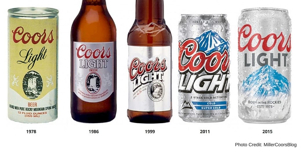
Coors Light: For beverage brands and food companies alike, logo redesigns are one of the best ways a brand can stay modern and relevant. As one of the best-selling beers in America, their elegant new look helps them stand out from other beer brand competitors. Retaining the historic mountain symbol and cursive font, the logo adapts a flat design that appeals to the millennial generation.
MINI: The three-dimensional logo was switched out for a flat design, just one color, making the logo very versatile and translatable to the web, apparel and merchandise. This was a bold move for Mini Cooper, and I wouldn’t be surprised if other big car brands followed suit.
Re-designing your logo can be a great decision for your brand. And while it can attract positive press and generate sophisticated design discussions, it’s important to tread lightly and consider everything before taking that big step.
What do you think about these 2015 logo updates?
By subscribing to our newsletter, you agree to our Privacy Policy.