Trends — they come and go. Some are worthy of attention and others are not. As a designer looking at trends, it’s important that you don’t throw yourself entirely into them. In other words, it is important to stay aware of current trends, but you don’t have to commit to them. The trends that stay awhile are the ones you will find yourself using — on purpose or not — without even realizing that you are following the mainstream.
For example, compare ads fifty years ago to today; the long columns of serif text have shifted to short headlines and big, bold, modernist fonts. This example supports that some trends are more than wishful ideas by self-appointed design gurus. There are a number of real, identifiable and measureable trends that really do reflect current tastes and design thinking.
This begs the question: What are today’s trends? What are the ones that you can look back on decades later as an integral part of brand history? Let’s take a look at the 2015 typography and image trends as defined by Creative Market and iStock.
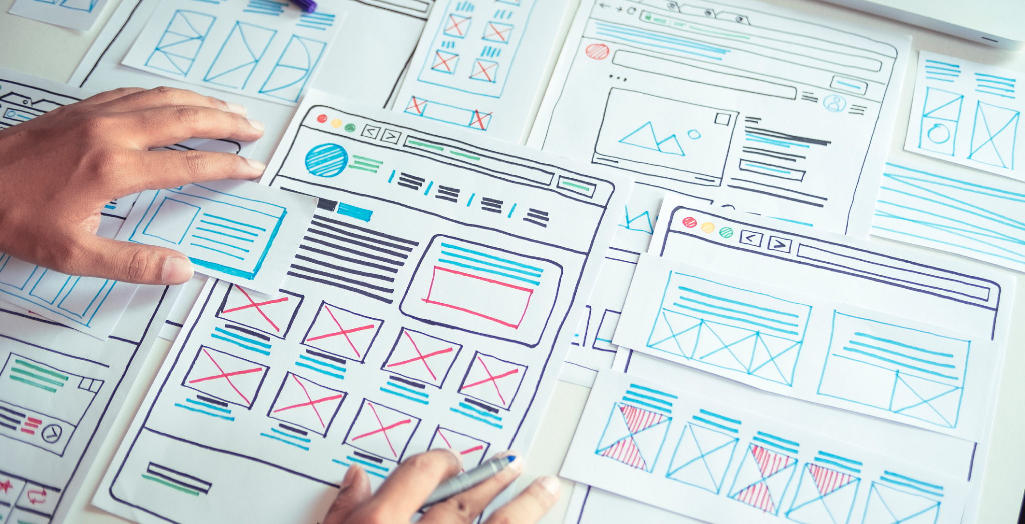
Typography Trends
1. Handwritten Fonts
The beauty of handwritten type lies in its flexibility, but keep in mind that they don’t mix very well with the corporate world. Handwritten fonts span from schoolgirl cursive to calligraphy, and you can specify personality traits, age and artistic style.
2. Icon Fonts (Webdings for the 21st century)
These are fonts that are icons; they are the simplest way to generate icons that are consistent and easily modifiable.
3. Letterpress-Style
This refers to the old-school letterpress hand-crafted type. This is widely used on posters and designed with an aged effect, which has detailed and inset markings to make the type looked pressed-in.
4. Photo Overlays
Yes, technically the memes and photo quotes you find on Instagram and Facebook are photo overlays. But for designers, this is more specific because legibility is important. Text seems to work best when laid over photos that can safely remain in the background. This kind of photo doesn’t contain distracting elements — elements that jump out at you.
5. Sticking to Basics
With the rise of flat and flat-inspired design gaining headway, the basic gimmick-free, web-safe fonts are back in style. Heavy drop shadows and gradients are now being cast aside; the emphasis is now on easily scalable type. Helvetica and Garamond remain popular, once again.
Imagery Trends
iStock by Getty Image has released its 2015 trends report detailing the biggest image trends designers need to know about. Results are based on image download data and usage trends from around the world.
1. All Kinds of People
For years, we have used images that maintain a specific idea of “beauty,” but now we thrive for something more intriguing — something with a story to tell. Modern design represents the world as it is now, not as it once was. This idea focuses on images that are real and authentic and helps a brand connect more fully with its audience.
2. Letterbox Look
The letterbox look accommodates a wide format, like your wide screen TV, tablet, smartphone or monitor. Think about it this way: The rectangle is the new square. Designing for mobile first, this idea is perfect for scalable large hero images on homepages. Influenced by Instagram, the tighter crop of images draws the focal point to a visual story while keeping the look both contemporary and classic.
3. Monochromatic Color
Sometimes less color can be more. A counter-trend to the multicolored world of screens, this takes a step back and allows the image to speak for itself. With a darker contrast of image to background ratio, bright whites and strong blacks, these images evoke a feeling of simplistic beauty.
4. Point of View (POV)
Selfies, the social media POV. We now look at others and ourselves in a different way. With selfie sticks and GoPros, we are able to capture images on the go in absurd angles. This offers the viewer a feeling of authenticity and believability.
5. Sensory Immersion
Sensory overload. We’re always looking at digital devices, but we yearn to feel, smell and taste as well. Images that engage and enliven multiple senses are increasing in dominance. These images have a deep focus on textures and tiny details, which work well on smaller screens.
6. Super Still Life
Small screens love big images. So designing responsive has led to a rise in the use of a new kind of still-life imagery. Still-life is no longer about the setup of single objects captured in a frame. It’s about creatively portraying inanimate objects but keeping an order and neatness to the arrangements.
When looking at these current trends it is important that you absorb the ideas, but be careful about getting bogged down. You should borrow from them, take inspiration from them and adapt them into your own forefront and your clients’ brand messages.
By subscribing to our newsletter, you agree to our Privacy Policy.