We have said it before and we certainly will say it again: Social Media is fluid, what is true one week may convert into a new truth the next.
Instagram is this week’s transformer. Yesterday morning when you checked your phone (most likely before you even got out of bed) you may have noticed that one of your little icons looked a little different on your home screen. On May 11, Instagram released their latest update that included two huge visual changes to the platform:
- New, very colorful logo
- Black and White User Interface
As social media professionals you may think that this small visual update doesn’t change much for your day-to-day activities. However, as professionals we know that even the slightest variation changes the way that users interact with the platform. Here are our top 5 things you should consider with the new Instagram update:
- Think past the platform. Work with your website developers and make sure that wherever you are promoting your Instagram account that you are using the new logo.
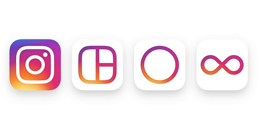
- The changes affected Layout, Hyperlapse and Boomerang. This is their way of ensuring that both users and professionals know the connection between these tools and the platform. Don’t overlook the power of these and be sure to incorporate the benefits of each app into your postings.
- Be bold with your image choices. The sleek and simple look was implemented to make your photos stand out. “While the logo is a colorful doorway into the Instagram app, once inside the app, we believe the color should come directly from the community’s photos and videos,” wrote Ian Spalter, Instagram’s head of design. Don’t be afraid to try something new, add pops of color or overtake the image with eye-catching hues.
- Take a look at your account picture. With the mostly black and white approach this gives your brand another chance to catch a user’s eye in an unexpected place.
- Don’t forget about Instagram advertising. While the changes and execution of Instagram ads is a blog topic we will tackle another day, consider the experience from the user standpoint. Don’t forget to how your ads will looks as they are delivered on this new background and how that could impact the experience for your target audience.